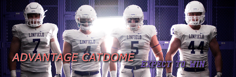
 1) Linfield College
The ‘Cats had a major uni overhaul about 11 seasons ago and since then Linfield has only tweaked the font a little bit. The outcome is a clean and standout look. I’ve never been a fan of the wild piping you see with so many college and HS football uniforms and Linfield avoids all of that with a classic purple on white with an all-white lid. What pushes Linfield’s look to the top is the use of the ‘Cats red in the logo. The look is at its best when the ‘Cats use the red on white cleats to round out the look. It’s a traditional but still fresh look that hasn’t gone out of style.
 2) Pacific Lutheran
If I wasn’t such a huge Linfield mark the PLU home digs just might be #1. The ‘Lutes have a great color scheme and the “LUTES” on the back of each jersey makes the uniforms unique and captures the essence of EMAL football. The lids are nice with the white facemasks with gold body. I don’t know if I’m right about this but it seemed that PLU changed their gold from a shinny stain color to more of a flat gold and it looks much cleaner. Overall, just a nice uniform with a touch of uniqueness with the nameplates that has PLU home gear towards to top of the NWC heap.
 3) Willamette
Part of Willamette’s shtick is the constant changes and tweaking of the uniforms. It seems that just about every year Willamette has some sort of different uniform change. The Bearcats get huge props for the lettering and numbers being embroidered. That adds a classy element to the uniforms. However, I hate the monochrome uniforms. I mean I HATE MONOCHROME uniforms. I know WU will break out the white pants with a gold pointed stripe on the pants but that look was just awkward because the gold was so light it was hard to see and it didn’t fit the tops at all. After the first game, WU pretty much ditched the white pants and went with the cardinal red. It’s just way too much red for my liking and some of the WU linemen start to look like the Kool-Aid man. Other than that criticism, I like the jersey piping (not over done) and the jersey font is nice. Not in Linfield or PLU’s class of look but still a solid effort.
 4) Puget Sound
OK, I’m more traditional in how I like my uniforms but there is so traditional that you go into the dreaded plain zone. UPS home gear has a firm location in the plain zone. The maroon looks sharp but the uniforms are just lacking a finishing touch that could make the look a little better and fresher. For one, they need to ditch the black cleats and go with maroon on white. And they need to either add something on the pants, a shoulder stripe, or helmet decal. The uniform is just OK but who wants to wear something that is just OK?
 5) Menlo
Menlo recently altered their school athletics logo and looks like they are mixing in light brown with the blue and white. I’m assuming we’re going to see some new gear this fall but in the meantime I only have what they have sported in the past. Again, did I tell you I hate the monochrome uniform? It’s just a lot of….blue. Not crazy about their number font or the pointy shoulder stripe. I know they are a little busier than the UPS uniforms but they are busier in a bad way.
 6) Whitworth
Any way you slice it this is an ugly uniform. Ask Coach Tully and he’ll probably tell you that he doesn’t give a rip what the uniforms look like and I believe that 100%. I mean, just one look at their uniforms will tell you that. Again, another monochrome uniform and the fonts and the jersey tops are just bad looking. The jersey font has an inner and outer maroon stroke but it just blends into the black uniform. The tri-colored collar is about the only saving grace on the uniform. A few years back, Whitworth changed out their logo to a sleeker looking pirate flag with a “W” in the middle but the helmet decal doesn’t standout at all. It’s just a bad look all around.
 7) Lewis & Clark
I’m really pulling for L&C to become a competitive and stable football program but I have to be honest. That might be the worst home uniform that I can remember. Again, an all black monochrome uniform and pure orange font on the black jerseys that creates an obscene home look. Just to add to that misery the Pios threw two pure orange stripes on the shoulders and it looks like Halloween just threw up on Palatine Hill after a 5th of Jager. The look could be improved 10 fold by just adding a white inner/outer stroke to the jersey font.
 8) Unhonorable Mention - Linfield's All-Purple Look
Did I mention I hate the monochrome uniform and Linfield’s all-purple get ups might be the worst? I love Linfield football with a passion but I’m praying that the coaching staff will look at the 2009 schedule and say “We have 4 regular season homes games this year. Let’s not make Wildcat 11 want to poke out his eyes for a ¼ of it by wearing that horrible all-purple get up”. First off the all-purple makes a number of our linemen look like they are a double for Grimace. Second, it just doesn't look like Linfield to me. I don't know...I guess I'm getting older but get the All-Purples off my lawn! Any seniors reading this….please, please, please ditch this horrific look for the 09 season. Heck if you guys want to do something different then ask the staff if you could go all white for a home game. Just leave the purple pants on the shelf for home games.
5 comments:
So it's been 11 years since the last uniform overhaul but what about the logo? I love Linfield's uniform but I think that logo is falling behind. Linfield had it's 150th year last year and I think a great way to celebrate the turning toward another 150 years would be to re-do the Wildcat logo...something without the ancient sailor hat.
They did change the wildcat logo in 1992. They changed the body of the hat from black to purple. Maybe the could go back to black but really I don't want them to touch the Wildcat head logo anymore than that.
When people see that logo they know that is a Linfield Wildcat. It's unmistakable and totally unique in the vast landscape of all the other college and high school who have a wildcat as their mascot.
I don't speak for the alumni base but I for one would be VERY upset if they made any major changes to our logo.
Leave our Wildcat alone.
You hit the nail on the head with the all purple look...horrible. On the flip side I LOVE the all white, I've always thought the all white was sharp as hell! I really think that should be the standard road uni...
DT48,
I feel better that I'm not the only one. I've been beat up a little bit via text by some of the younger cats about how they think the all-purples are great. Misguided youth.
I think the staff wouldn't mind all whites on the road but the white pants get too beat up/dirty on grass so they go purple pants on the road with grass teams.
You can't forget about the all purple home uniforms with the black spat look. Obviously i'm a little bias cause we seniors came up with the idea.
Post a Comment